Manufacturing Guide
Pantone Color Matching Fails? Understand Light Boxes, Dye Lot Variations & Batch Tolerance
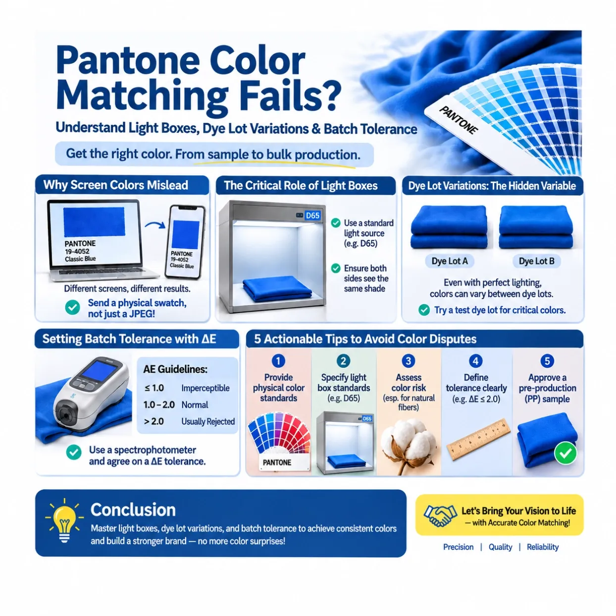
Pantone color matching failures in custom garment production, which frequently cause costly disputes, primarily stem from the gap between screen and physical colors, the critical role of standardized
Pantone Color Matching Issues in Apparel Manufacturing: Light Boxes, Dye Lot Variations & Color Tolerance Explained
When developing a custom clothing line, getting the colors right is essential to maintaining brand consistency. You may provide your manufacturer with a Pantone color reference, approve a lab dip, and expect the bulk production to match perfectly. However, the final fabric may still look different from your approved sample.
Why does this happen?
In apparel manufacturing, accurate color matching involves more than simply following a Pantone number. Lighting conditions, fabric properties, dye lot variations, and acceptable color tolerances all influence the final result.
Understanding these factors can help fashion brands avoid costly production mistakes, reduce color disputes, and maintain consistent product quality.
In this guide, we'll explain how light boxes, dye lot variations, and ΔE color tolerance affect Pantone color matching—and what you can do to achieve more consistent colors from sampling to bulk production.
1. Why Pantone Colors Look Different on Screens and Fabrics
One of the most common mistakes in custom clothing production is relying entirely on digital color references.
A Pantone color displayed on a computer monitor, smartphone, or digital design file may look different from the actual physical color standard. This is because screens use RGB light to display colors, while fabrics reflect light from their surfaces.
Screen brightness, color profiles, display settings, and ambient lighting can all affect how a color appears.
For example, Pantone 19-4052 Classic Blue may appear slightly different across devices, even when everyone is viewing the same digital reference.
There is another important consideration: Pantone offers different color reference systems for different applications. A paper-based Pantone color guide is not necessarily an appropriate production standard for textile dyeing.
For apparel manufacturing, brands should select the appropriate textile color reference and provide a physical standard whenever possible.
How to avoid color mismatches:
- Provide a physical Pantone textile color standard or approved fabric swatch.
- Specify the Pantone color system and reference edition.
- Avoid using screenshots, JPEG files, or phone photographs as the only color reference.
- Keep an approved physical sample for comparison during bulk production.
A clear physical color standard gives both the brand and manufacturer a more reliable starting point for color development.
2. The Importance of Light Boxes in Fabric Color Matching
Have you ever noticed that the same fabric looks slightly different under sunlight, office lighting, and store lighting?
This is a common challenge in textile color evaluation.
The reason is related to a phenomenon called metamerism. Two colors may appear to match under one lighting condition but look different when viewed under another light source.
For example:
- Under warm incandescent lighting, a blue fabric may appear slightly warmer.
- Under cool fluorescent lighting, the same fabric may look different in tone.
- Under natural daylight, differences between two fabric samples may become more noticeable.
This is why professional apparel manufacturers use standardized light boxes, also known as color assessment cabinets or light booths.
A light box provides controlled lighting conditions so that manufacturers and buyers can evaluate fabric colors more consistently.
Common industry light sources include:
Light source | Typical application |
|---|---|
D65 | Simulated natural daylight |
TL84 | Commercial store lighting |
A | Incandescent or warm indoor lighting |
UV | Evaluating optical brighteners and fluorescent effects |
For most apparel color approvals, D65 is an important reference light source. However, checking additional light sources may be necessary when products will be sold under different retail lighting conditions.
What should you specify in your tech pack?
- The required primary light source, such as D65.
- Additional light sources if required, such as TL84.
- The color assessment method and viewing conditions.
- The approved physical color standard.
Using consistent lighting conditions helps prevent subjective color disagreements between brands and manufacturers.
3. Dye Lot Variations: Why Fabric Colors Change Between Production Batches
Even when the same Pantone reference and dye formula are used, fabric colors may vary slightly between production batches.
This is known as dye lot variation.
Textile dyeing is a complex process influenced by multiple factors, including:
- Dye concentration and formulation.
- Water temperature and dyeing time.
- Fabric composition and construction.
- Dye bath pH and chemical conditions.
- Dye absorption and finishing processes.
- Equipment settings and production conditions.
Small differences in these variables can affect the final color appearance.
Fabric composition also matters. Cotton, polyester, linen, and other fibers have different dyeing characteristics and may require different dye systems and processing methods.
For example, cotton is commonly dyed using reactive dyes, while polyester typically requires disperse dyes. Even when both fabrics are developed toward the same target color, their final appearance and color consistency may differ.
Another challenge occurs when a large order requires multiple dye lots.
If the body fabric, sleeves, collars, or ribbing are produced in separate batches, noticeable shade differences may appear between garment components.
How to reduce dye lot variations:
- Request a test dye lot before bulk production, especially for critical colors.
- Ask the manufacturer to use the same dye lot for all fabric components whenever possible.
- Avoid mixing fabric from different dye lots within the same garment.
- Request shade band approval before cutting and sewing.
- Check fabric color consistency before bulk cutting begins.
For large apparel orders, proper dye lot management is essential to maintaining consistent colors across the entire production run.
4. Understanding ΔE: How to Set Color Tolerance for Bulk Production
Perfect color matching is difficult to achieve in industrial textile production. Therefore, brands and manufacturers need to establish an acceptable color difference before production begins.
One commonly used measurement is ΔE (Delta E), which represents the numerical difference between two colors.
A spectrophotometer can measure the color data of a physical sample and compare it with an approved reference standard.
A lower ΔE value generally indicates a closer color match.
The following values can serve as an introductory reference:
ΔE value | General interpretation |
|---|---|
≤ 1.0 | Very close color match |
1.0–2.0 | Small color difference |
2.0–3.0 | More noticeable difference |
Above 3.0 | Significant difference |
However, these values should not be treated as universal apparel industry acceptance standards. Actual acceptance limits depend on the color difference formula used, fabric characteristics, product requirements, viewing conditions, and brand quality standards.
For more accurate color control, brands should agree on the following before bulk production:
- The approved physical color standard.
- The ΔE calculation method, such as CIEDE2000 (ΔE00).
- The maximum acceptable color difference.
- The required measurement conditions.
- The procedure for handling samples outside the agreed tolerance.
Using a spectrophotometer provides objective measurement data and helps reduce disagreements based solely on visual judgment.
5. Five Practical Ways to Avoid Pantone Color Matching Problems
Color disputes can delay production, increase costs, and affect the consistency of your clothing collection.
Here are five practical steps that fashion brands can take to minimize color matching problems.
1. Provide Physical Color Standards
Always send an approved physical Pantone textile reference or fabric swatch to your manufacturer.
Digital images should only serve as supplementary references, not the final production standard.
2. Specify Light Box Requirements
Include the required light sources, such as D65 and TL84, in your tech pack or quality control requirements.
Both parties should evaluate color samples under the same agreed lighting conditions.
3. Evaluate Dye Lot Risks Before Bulk Production
Discuss potential color variation with your manufacturer, particularly for sensitive colors such as emerald green, turquoise, deep red, and black.
Consider conducting a test dye lot and approving shade bands before bulk cutting.
4. Establish Clear Color Tolerance Standards
Agree on an acceptable ΔE value and measurement method before production begins.
Document these requirements in your purchase order, technical specifications, or quality agreement.
5. Approve the Pre-Production Sample Before Bulk Manufacturing
Never rely solely on a digital mockup or initial lab dip for final approval.
Review the pre-production sample under the agreed lighting conditions and confirm that the fabric color, garment components, and finishing meet your requirements.
Keep a signed or documented approval sample as the reference for bulk production inspection.
6. Why Choosing the Right Custom Clothing Manufacturer Matters
Pantone color matching is not simply a matter of selecting a color code. It requires a controlled process that connects color development, textile dyeing, sampling, and bulk production quality control.
An experienced custom clothing manufacturer should understand how to:
- Interpret Pantone textile color standards.
- Coordinate lab dips and fabric color approvals.
- Evaluate fabric colors using standardized light boxes.
- Manage dye lot consistency.
- Measure color differences using spectrophotometers.
- Establish clear color tolerance requirements.
- Conduct pre-production and bulk production inspections.
More importantly, a professional manufacturing partner should communicate potential color risks before they become production problems.
Conclusion: Achieve Consistent Pantone Colors from Sampling to Bulk Production
Color consistency plays an important role in building a recognizable and trustworthy clothing brand.
Although minor color variations can occur during textile production, many color disputes can be prevented through proper planning, standardized lighting, dye lot management, and clearly defined color tolerances.
By providing physical color standards, specifying light box requirements, agreeing on ΔE limits, and approving pre-production samples, you can significantly improve color consistency throughout the manufacturing process.
Looking for a reliable custom clothing manufacturer?
We understand how important accurate color matching is to your brand. From Pantone color development and fabric sourcing to sampling and bulk production, our team focuses on quality control, transparent communication, and consistent manufacturing standards.
Contact us today to discuss your custom apparel project and bring your clothing designs to life—with fewer color surprises and greater confidence in every production run.